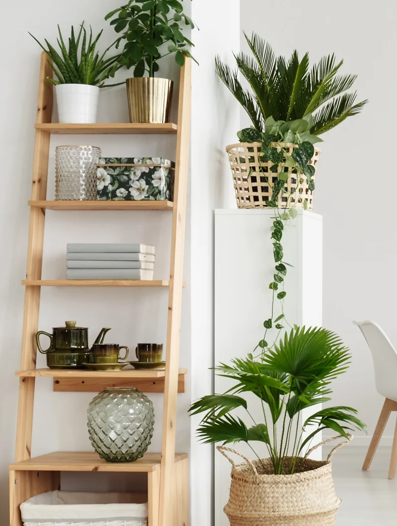
One of the easiest ways to spruce up a space is to add greenery – real or faux. If you’re into caring for live plants, that’s great, but the artificial ones have come a long way in terms of looking and feeling realistic also, so if you don’t have a green thumb, don’t worry – you can still enjoy the look of greenery in your space.
I add them to almost every design for several reasons — plants help a space feel more fresh, more stylish, more finished, and most importantly, more cozy and “lived in.”
If you’re wondering where to add them, consider any dead space that you have in the room, such as in corners or next to sideboards or TV stands.
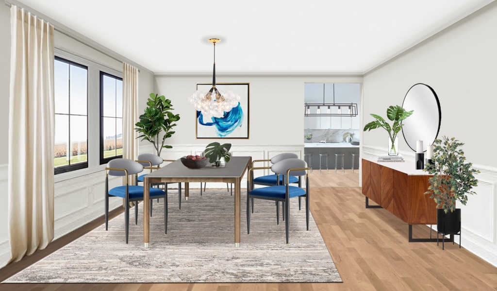
Contemporary Dining Room, Black Cat Interiors
Plants also add a nice pop of green to shelves:
Bookshelf Styling, Black Cat Interiors
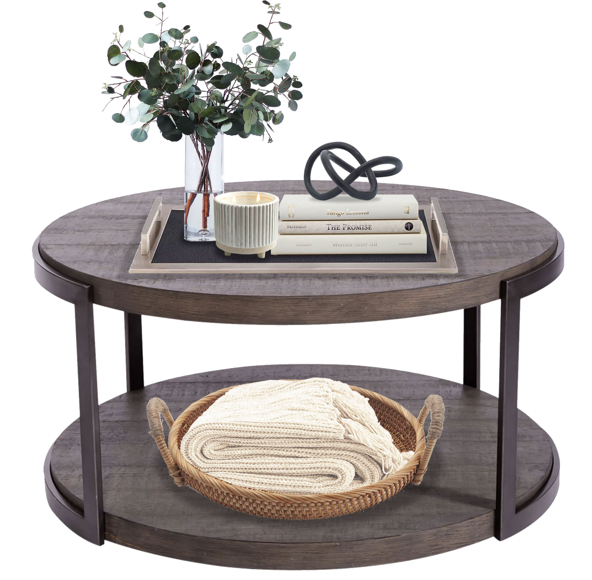
And work great as centerpieces on table top spaces:
Coffee Table Styling, Black Cat Interiors
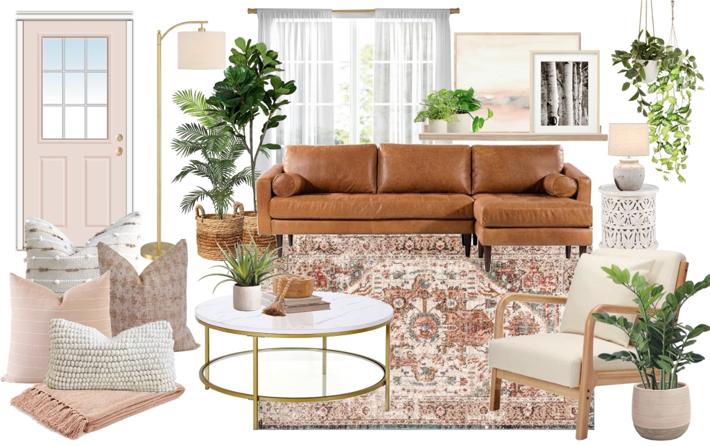
If your style leans boho or organic, use lots of plants:
Boho Living Room Moodboard, Black Cat Interiors
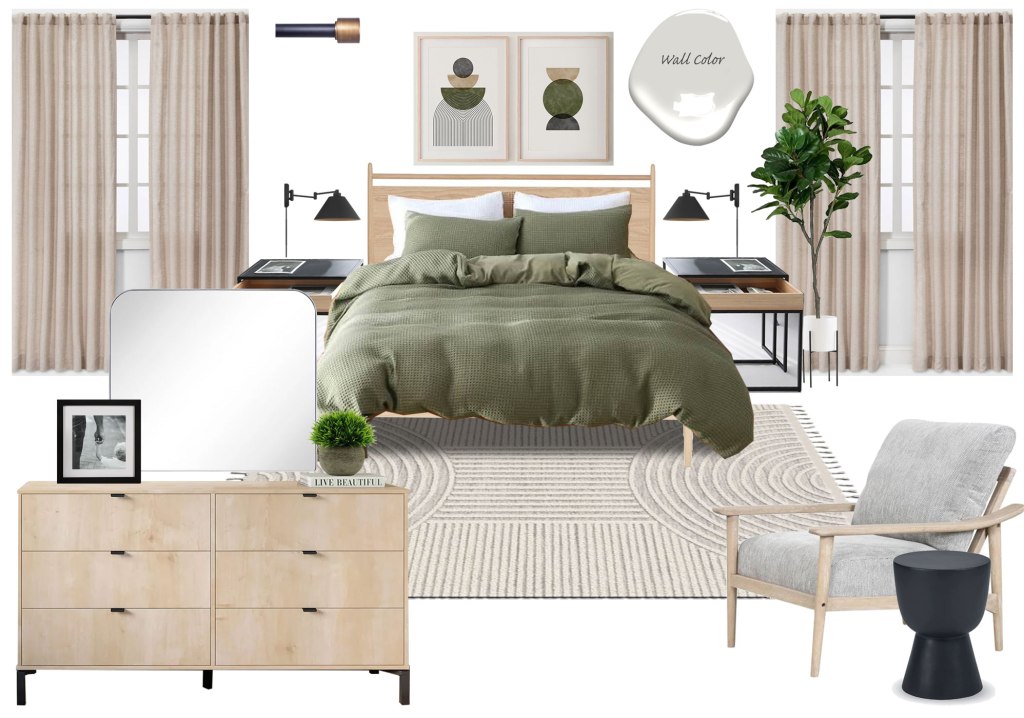
However, if you tend more toward modern or mid-century, then keep the plants simple:
Mid-Century Modern Bedroom Moodboard, Black Cat Interiors
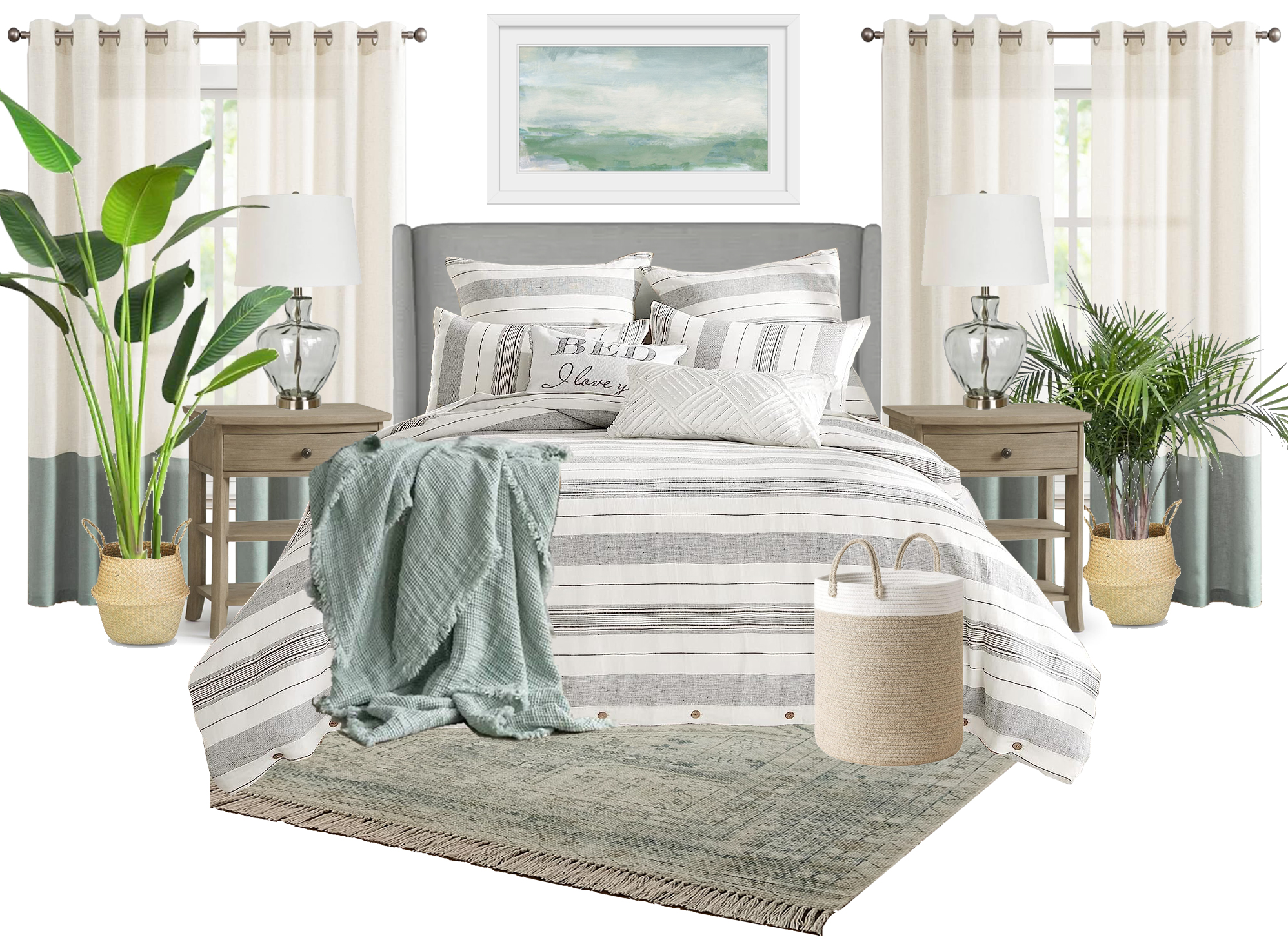
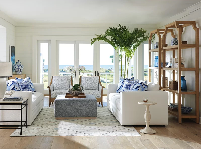
If you love a coastal look, then incorporate tropical plants into your space:
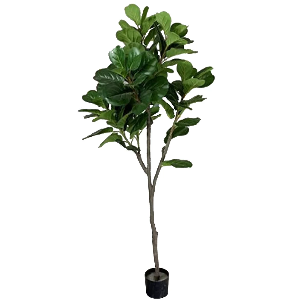
If you’re familiar with my work, you may have figured out that my favorite plant is the fiddle leaf fig tree.
Artificial Fiddle Leaf Fig Tree, Black Cat Interiors
Wildly popular and versatile, this beautiful plant seamlessly integrates into almost any style or space–note that in the above designs, I used it in boho, contemporary and mid-century designs.
As mentioned, indoor plants are a quick and easy way to enhance the overall appearance of a space and one of my favorite finishing touches. Studies also show that plants can enhancemoods, increase creativity, reduce stress, and–if using live plants–can eliminate air pollutants. So when putting together your spaces, don’t forget the plants.
Many clients ask me at the beginning of a project whether I can work with their existing pieces and/or design choices — art, furniture, flooring, tile, etc. As I’ve said in a few of my other posts, the answer is, it depends…
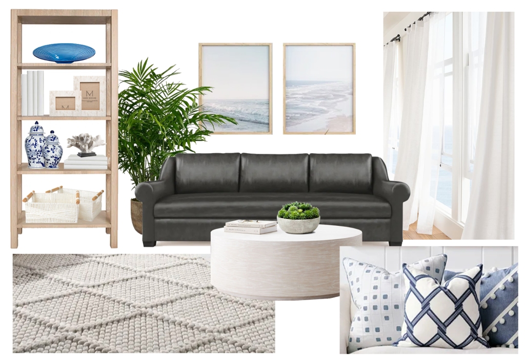
Existing elements can always be worked into a design but the end result may not always be what was desired. For example, many clients have dark leather furniture for practical reasons, i.e. durability and ease of maintenance mainly — but want a light and airy coastal design like this:
So, can we incorporate dark leather furniture and still get this look? Not quite. Yes we can do an overall coastal look — but no, the design won’t be quite as light and airy as the picture above, because the light and airy feel is accomplished (in part) from the main pieces…which are white.
All hope isn’t lost however, and I’m always happy to try to incorporate existing pieces since it saves time and budget. So, a couple of options here:
Option 1: we incorporate the existing black leather seating but keep everything else light and airy to balance it; we’ll get a hybrid look that isn’t quite as breezy, but still has a coastal feel:
Modern Coastal Living Room Moodboard by Black Cat Interiors
Option 2: we modify the existing seating; adding a custom-made slipcover will accomplish both goals of keeping the existing furniture while still achieving a light and airy feel.
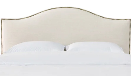
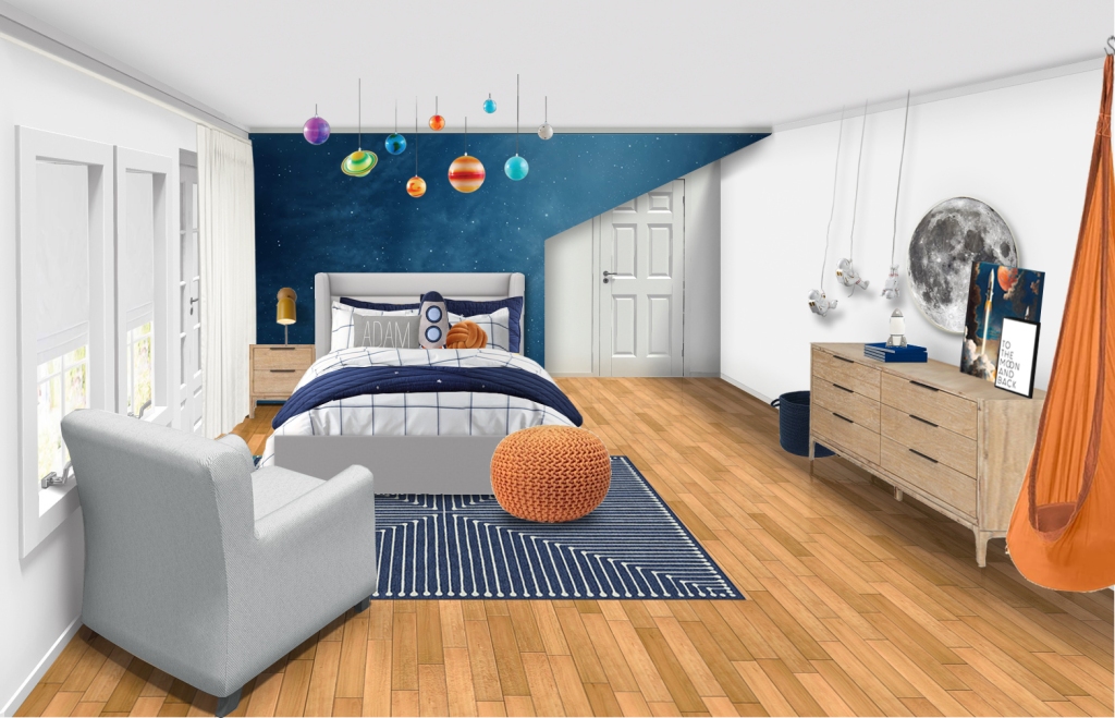
Sometimes however, the best way to proceed is to replace the item. One of my recent projects was converting a nursery into a little boy’s room. There was a bed similar to the one below in the room that the client was hoping to use:
I love the bed itself, however its curved lines and nailhead trim have a feminine feel that didn’t fit with the aesthetic the client was wanting for her son’s room. She also wanted additional storage since there wasn’t a real closet in the room, so a new bed solved for both issues:
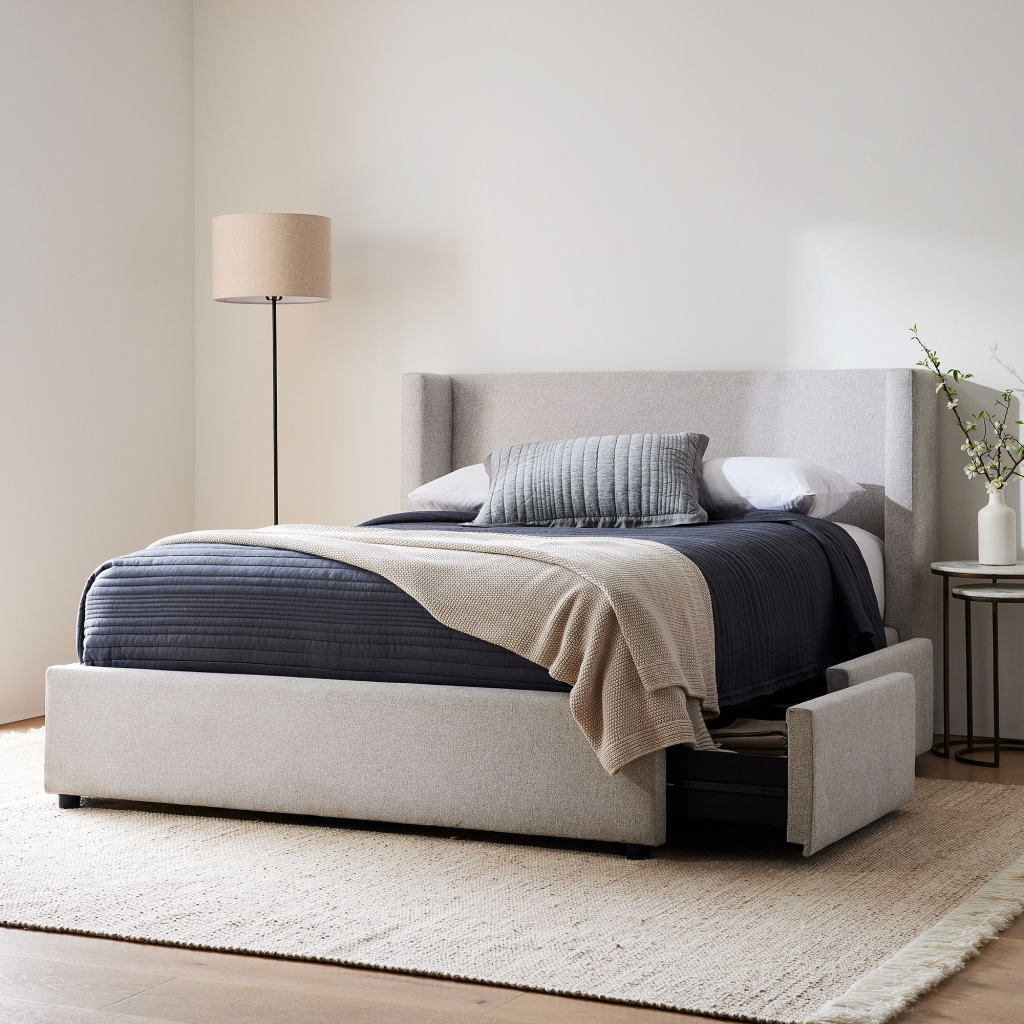
Shelter Side Storage Bed, West Elm
West Elm’s Shelter storage bed had cleaner lines that fit the design aesthetic, and provided the additional storage that the room needed.
Space Themed Boy’s Bedroom Design by Black Cat Interiors
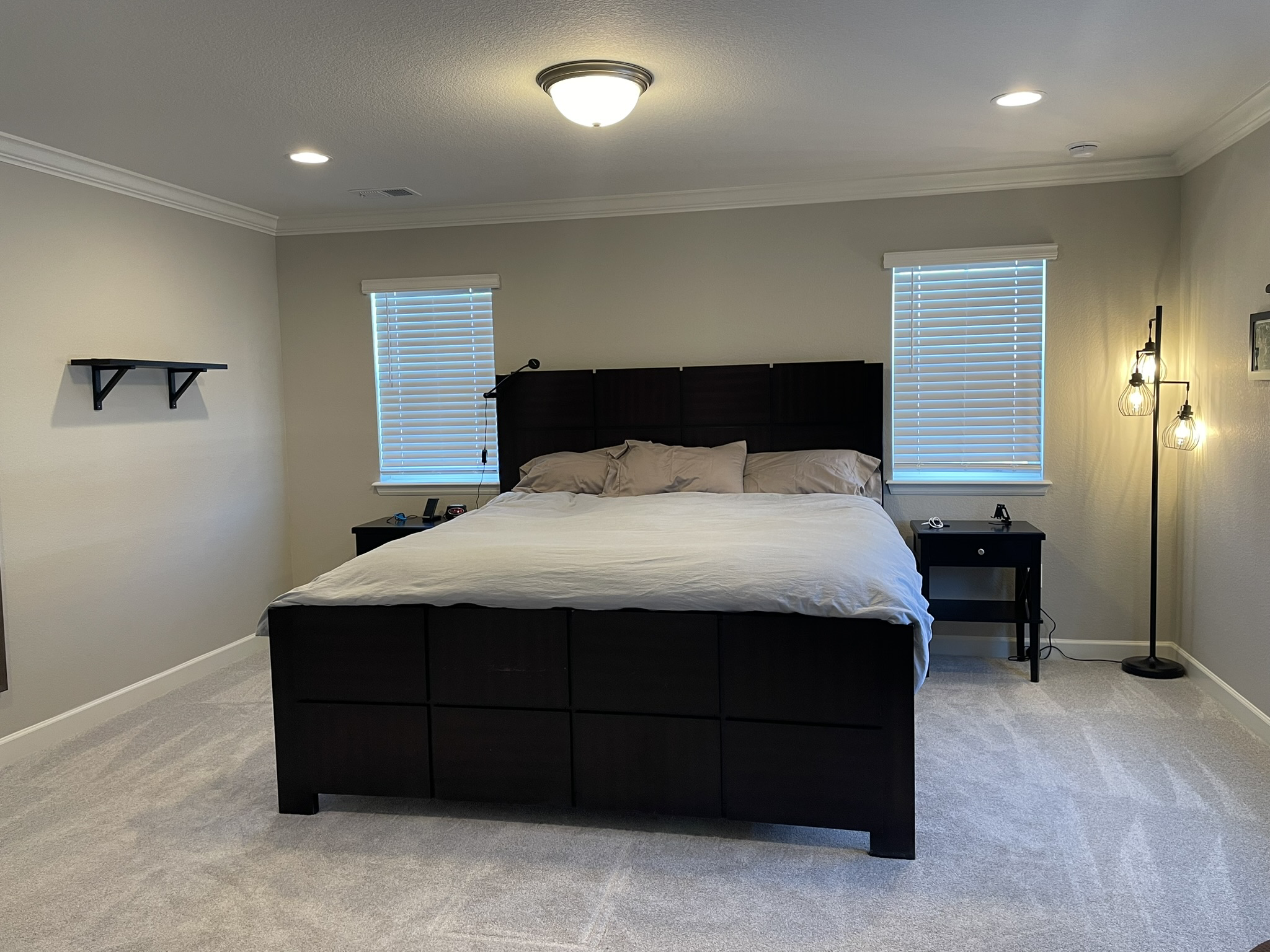
In some cases however, the existing furniture works great. As shown in the photo below, the client already owned a bed, nightstands, floating shelves and a floor lamp (also not visible here, a large wall mirror and recliner):
Since the existing items fit the overall aesthetic the client was wanting, I incorporated all items, just adding a few touches to make the room feel more finished:
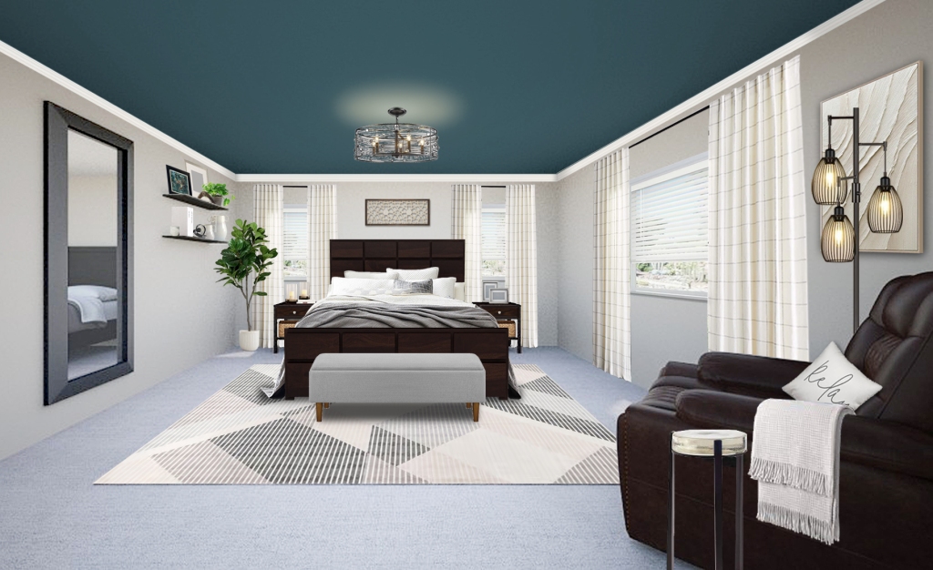
Transitional Bedroom Design by Black Cat Interiors
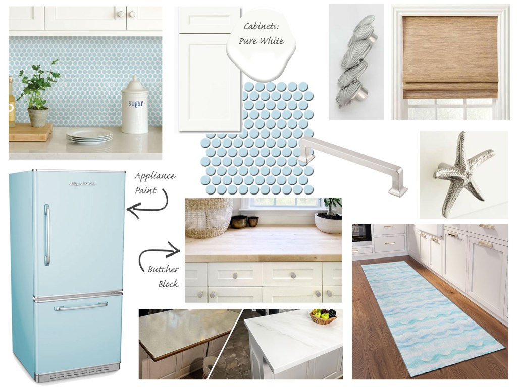
Circling back to Option 2 above, for those not afraid of DIY and some elbow grease, keeping existing elements and modifying them can save a lot of money. The moodboard below includes several relatively easy updates for a small kitchenette in the basement of a vacation rental. Painting cabinets and swapping out hardware are well-known updates, but did you know that appliances can be painted? Or that epoxy kits can refinish countertops to look like marble?
Coastal Kitchenette Design by Black Cat Interiors
If you’re unsure about whether to work with an existing item when redesigning a space, start by asking yourself,
does the item fit the design aesthetic that you’re wanting? if not, ask yourself…
are you OK with the compromise, noting that it is perfectly fine to mix styles as long as you like the end result. If you don’t want to compromise on the overall “look” however, consider…
modifying the existing item(s), i.e. painting/staining, slipcover/re-upholstering, etc. so that it better fits the design.
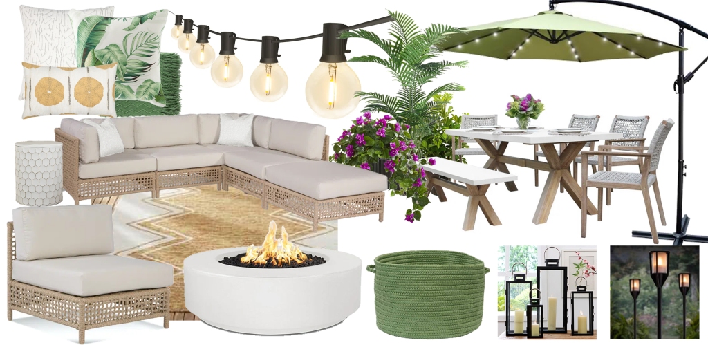
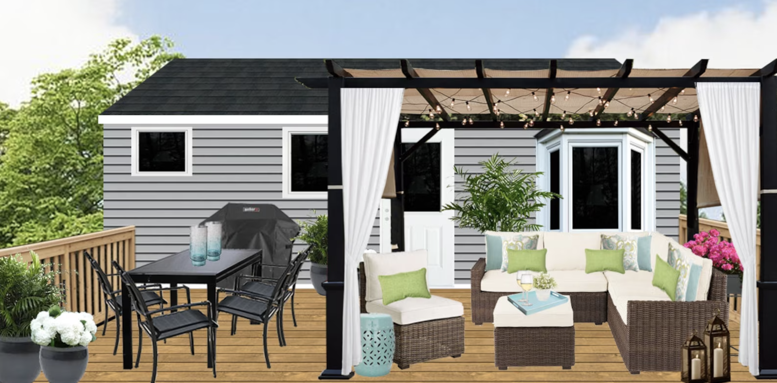
With summer approaching – like me – you might be thinking about your patio and outdoor living. If you have a big open space, furnishing your patio can be intimidating — a lot of my clients say they “don’t know where to start.” Similar to my recent post about designing basements, I approach designing patios by determining function first, then creating zones. Start by asking yourself, ‘How am I going to use the space?’
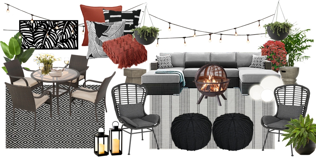
Projects can vary of course in size and scale, from tiny porches or patios with seating just for 2, to expansive patios with multiple levels and areas, etc, but in general when I ask clients how they’re going to use the space, the majority of them tell me, 1) sitting/lounging, and 2) dining. So let’s start there – in the moodboard below, I’ve included 2 zones, a lounge area, and a dining area.
Contemporary Patio Moodboard, Black Cat Interiors
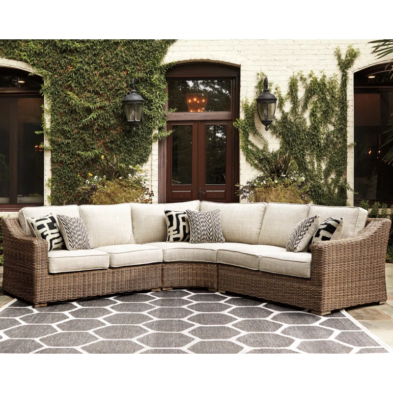
When choosing furniture, think about things such as, how many people you’d like to seat, flexibility (i.e. modular furniture that can be moved around/repositioned), longevity, and the texture that you prefer. I personally tend towards wicker (or wicker-look), and sectionals to maximize seating…
Beachcroft 3-Piece Outdoor Seating Set, Wayfair
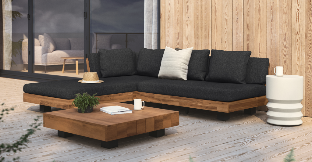
…but the wood look and/or teak is definitely growing on me. I like the clean lines and warm texture that it adds to a space.
Lubek Sectional, Article
I don’t personally love the look of metal or composite furniture, however if durability, longevity and low maintenance are at the top of your priority list, you can’t beat them.
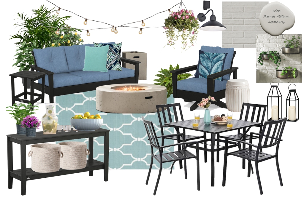
Patio Moodboard, Black Cat Interiors
Once you’ve identified your functions or zones, think about what other needs you might have, such as shade or protection from the elements. Cantilever umbrellas are great if you only need shade part of the time.
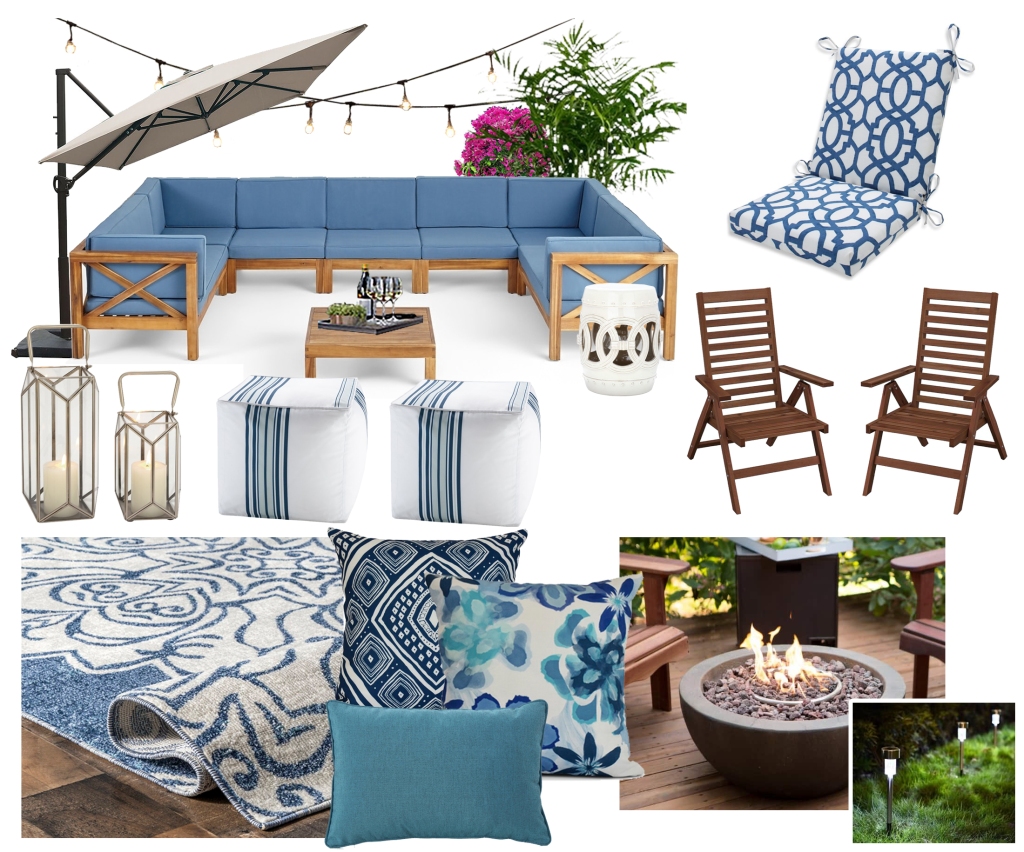
Coastal Patio Moodboard, Black Cat Interiors
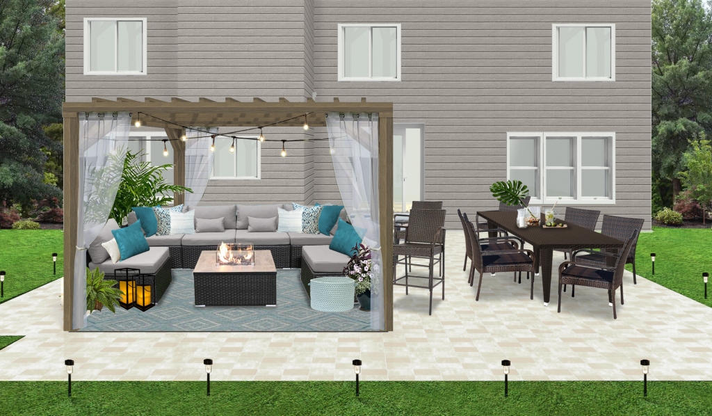
Or, for a more full-time solution, consider adding a pergola.
Contemporary Patio 3D Rendering, Black Cat Interiors
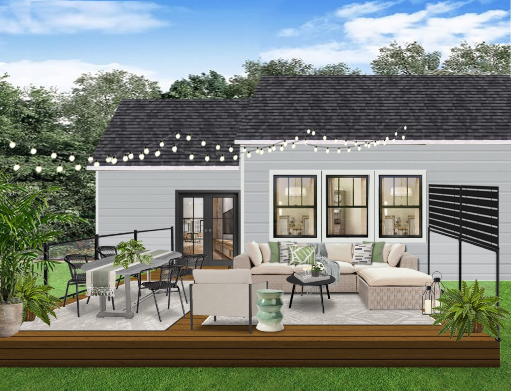
If you need privacy from neighbors, consider adding a screen.
Modern Patio 3D Rendering, Black Cat Interiors
After you’ve identified the main functions, think about finishing touches such as rugs, pillows, side tables and planters.
Modern Patio Moodboard, Black Cat Interiors
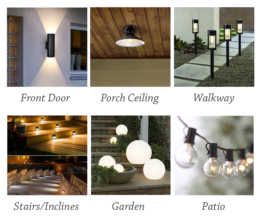
Lastly, don’t forget the lighting. From hard-wired fixtures, to solar options, exterior lighting is a great way to add ambiance to your outdoor space.
Exterior Lighting Consult, Black Cat Interiors
Use these tips to get the most out of spring and summer by getting your patio ready for outdoor living. Need more guidance? Contact me – I’d be happy to help!
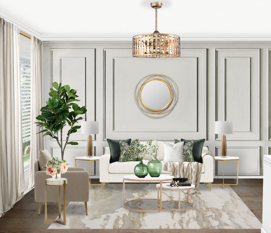
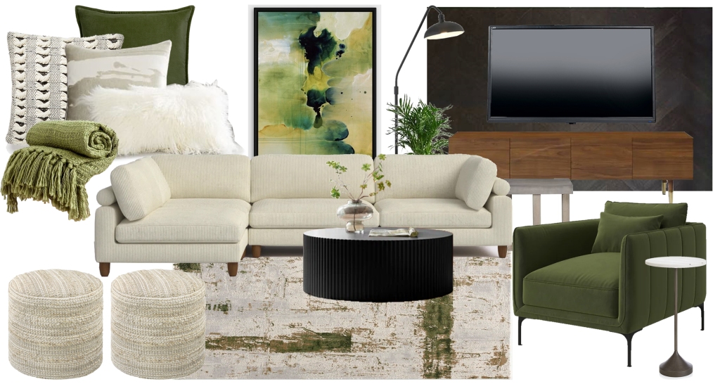
In honor of St. Patrick’s Day, let’s take a look at greens. I don’t typically gravitate towards green as an accent or main color but when I’m asked to use it, I find that I like it quite a bit.
In this modern glam condo, I love the deep dark greens paired with light soft neutrals, and gold accents.
Modern Glam Living Room 3D Rendering by Black Cat InteriorsModern Glam Kitchen Moodboard by Black Cat Interiors
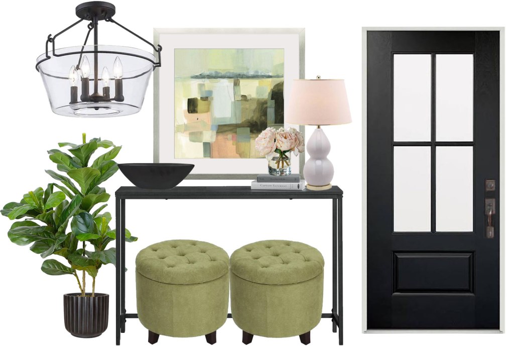
Soft sages and rich olives work well across a broad range of styles, from Transitional…
Transitional Foyer Moodboard by Black Cat Interiors
…to Modern/Contemporary.
Modern/Contemporary Living Room Moodboard by Black Cat Interiors
Greens are associated with nature, so ideal for outdoor spaces.
Contemporary Patio Moodboard by Black Cat Interiors
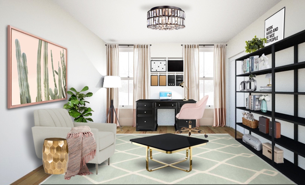
Greens also pair well with other accent colors, such as blush…
Green and Blush Home Office 3D Rendering by Black Cat InteriorsGreen and Blush Bedroom 3D Rendering by Black Cat Interiors
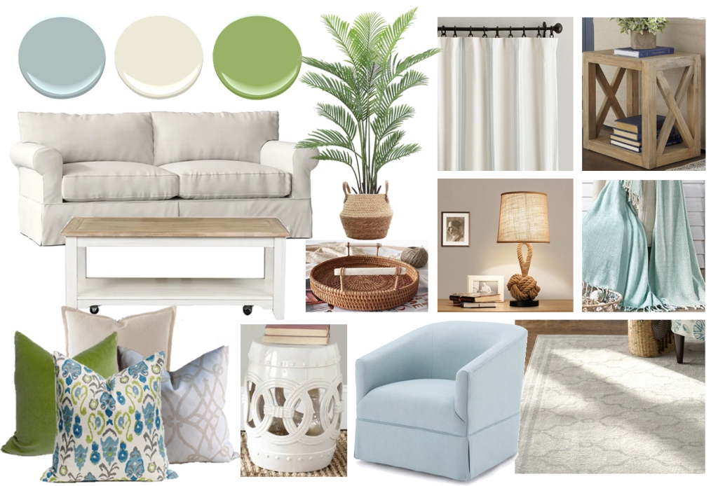
…and blue.
Coastal Living Room Moodboard by Black Cat Interiors
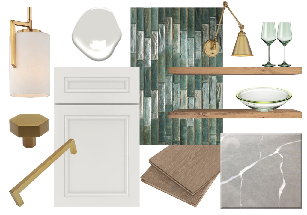
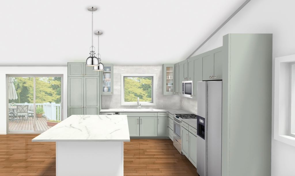
I love greens on cabinetry, such as in kitchens…
Transitional Kitchen 3D Rendering by Black Cat Interiors
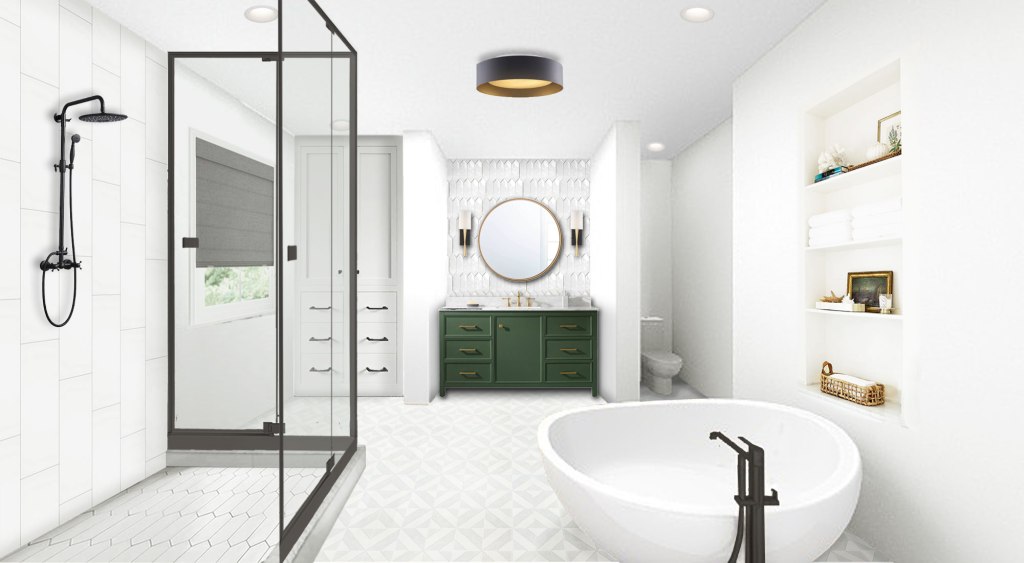
And bathrooms…
Contemporary Bathroom 3D Rendering by Black Cat Interiors
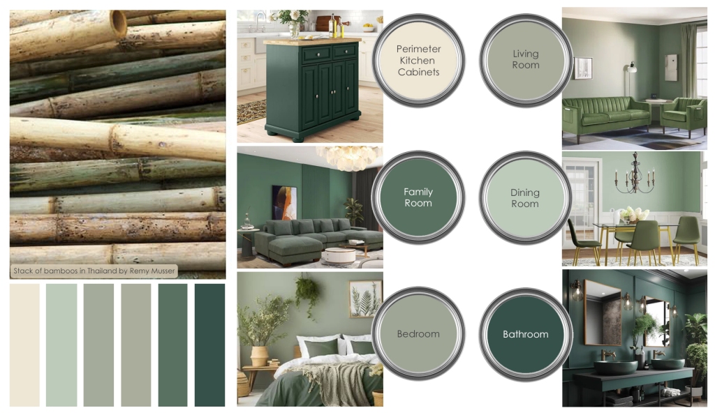
But green doesn’t have to just be an accent color. If – unlike me – you do gravitate towards greens, embrace it! Put it on your walls…
Greens Interior Paint Palette by Black Cat Interiors. All Room Images, Wayfair.com. Stack of Bamboos in Thailand Image by Remy Musser.
Green is often described as refreshing and tranquil and thought to represent tranquility, good luck, and health. If you’re ready to make a change to your home’s interior or exterior, consider going green.
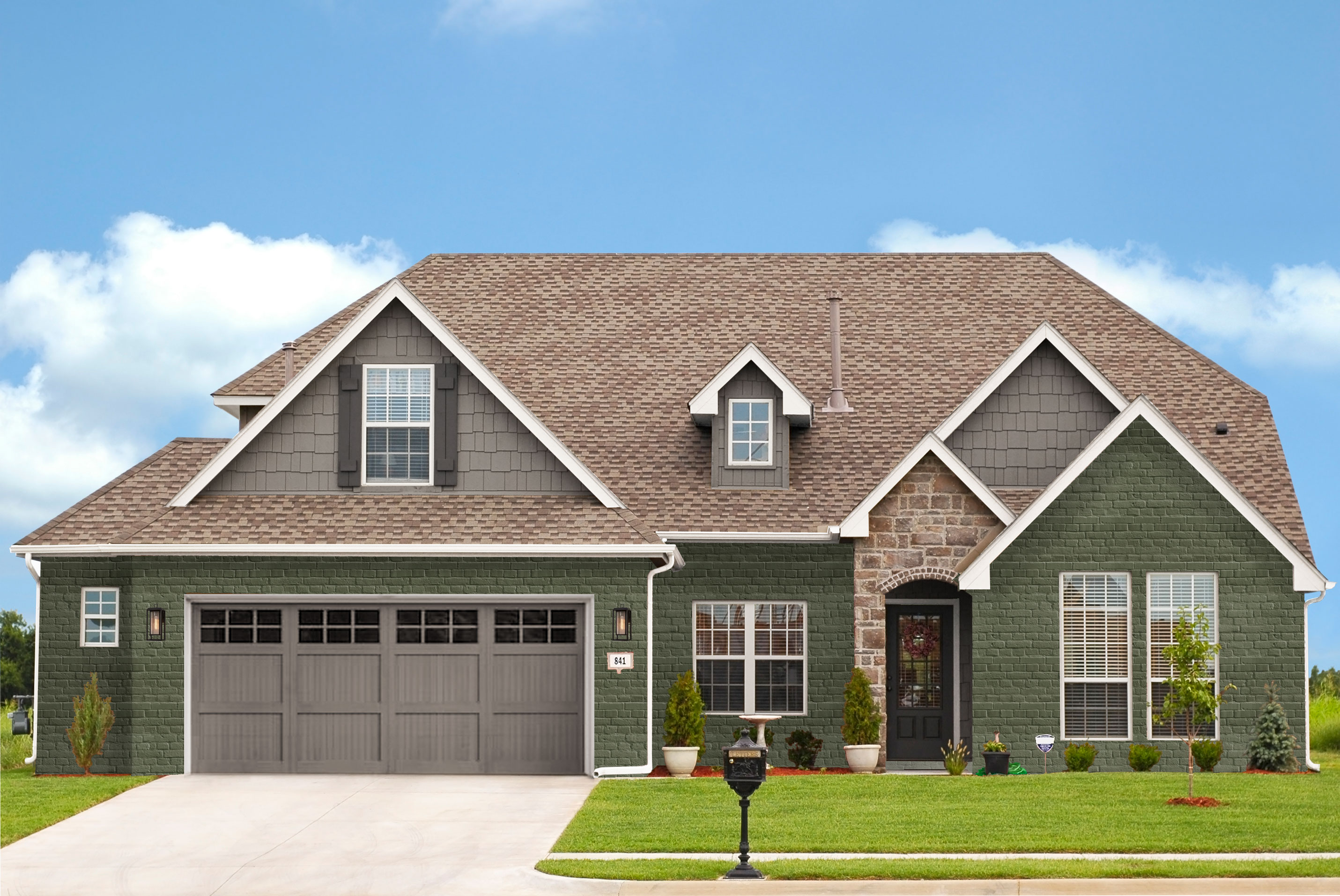
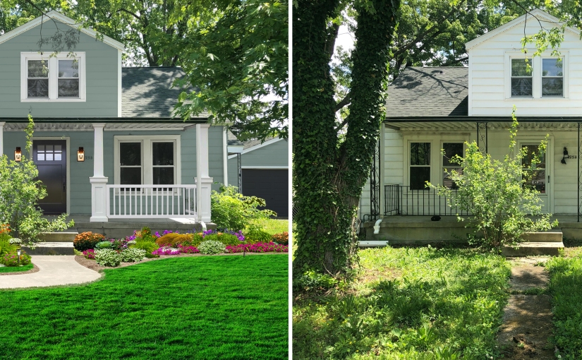
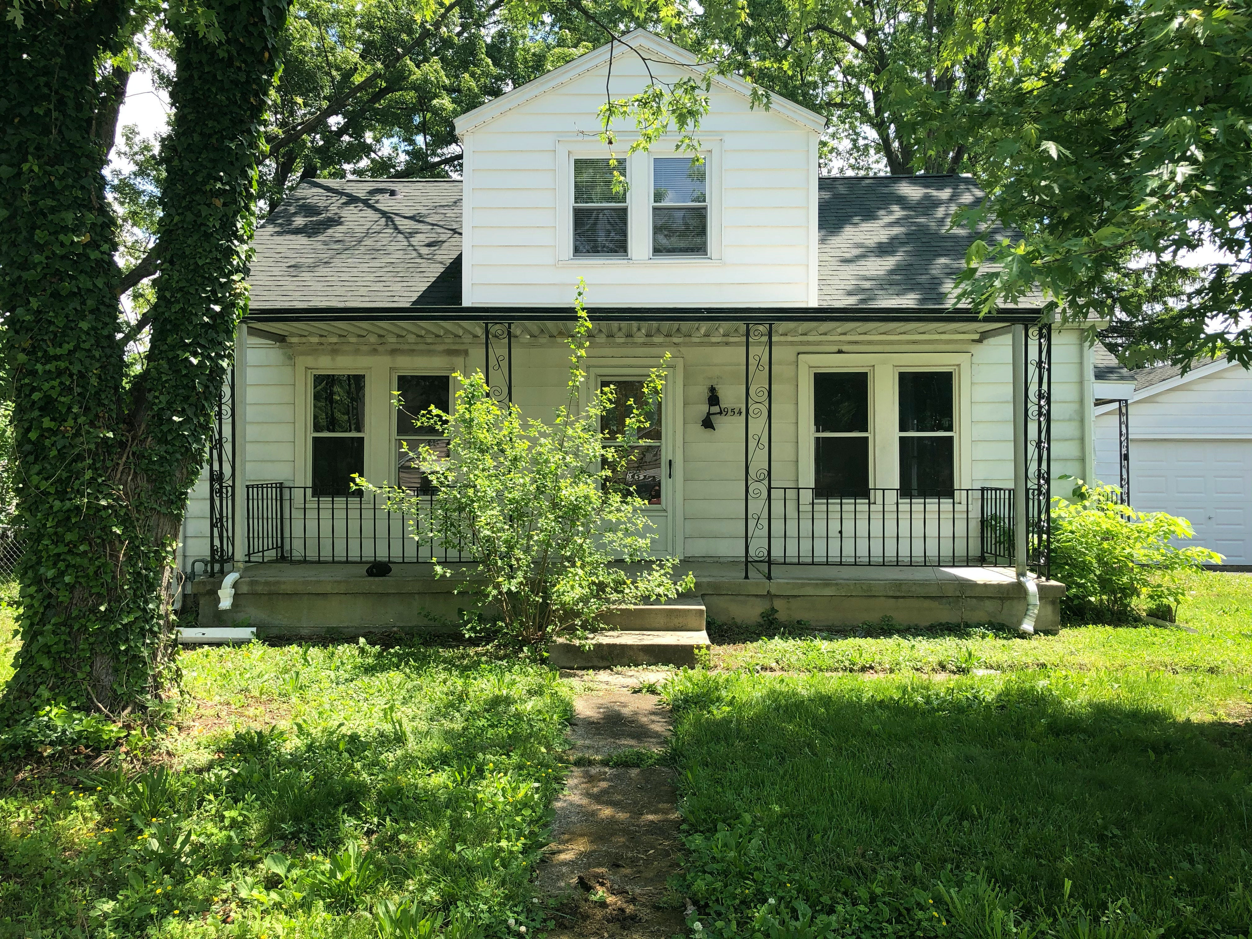
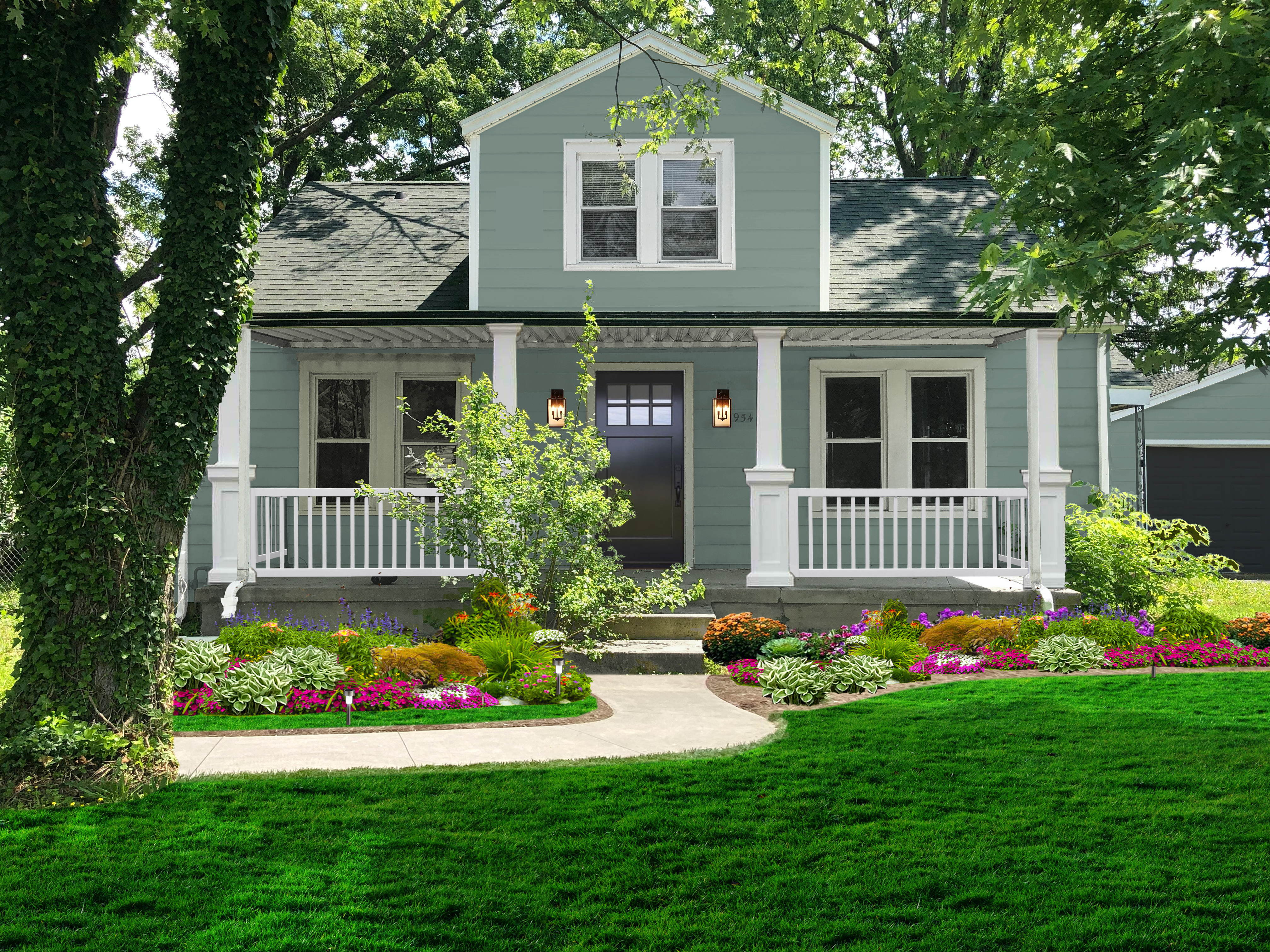
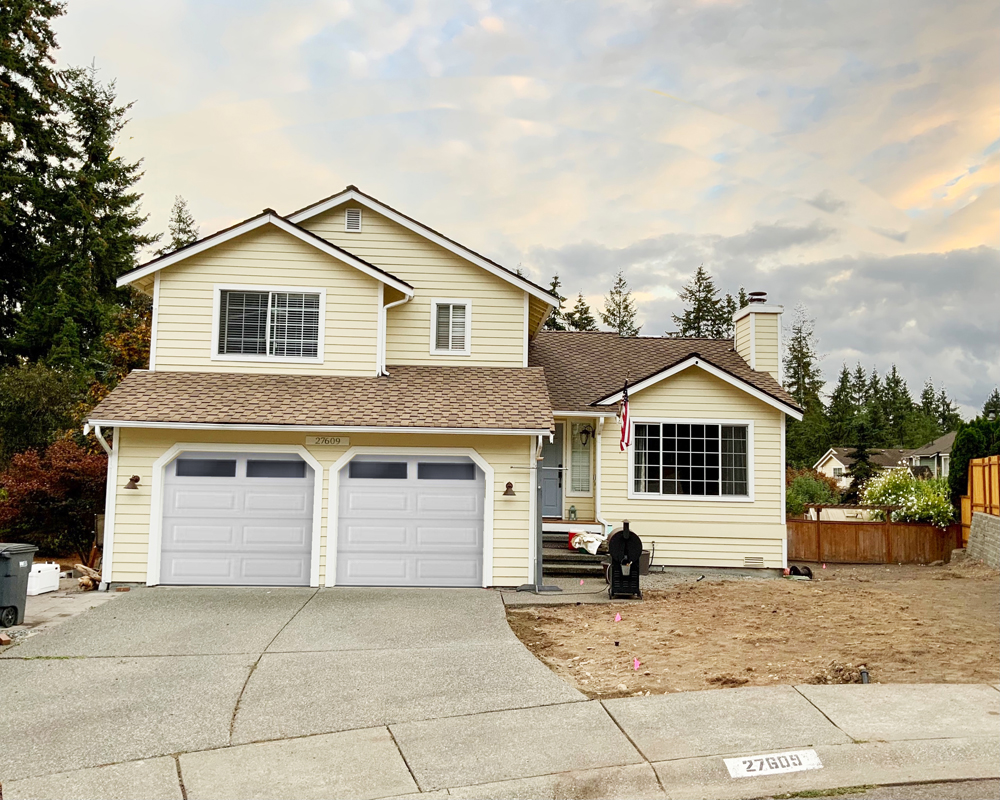
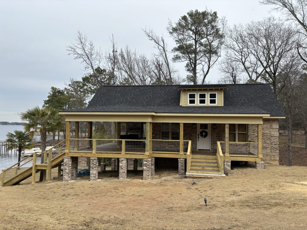
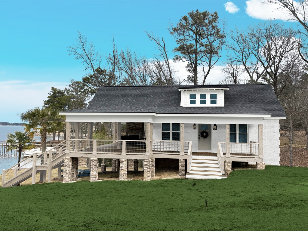
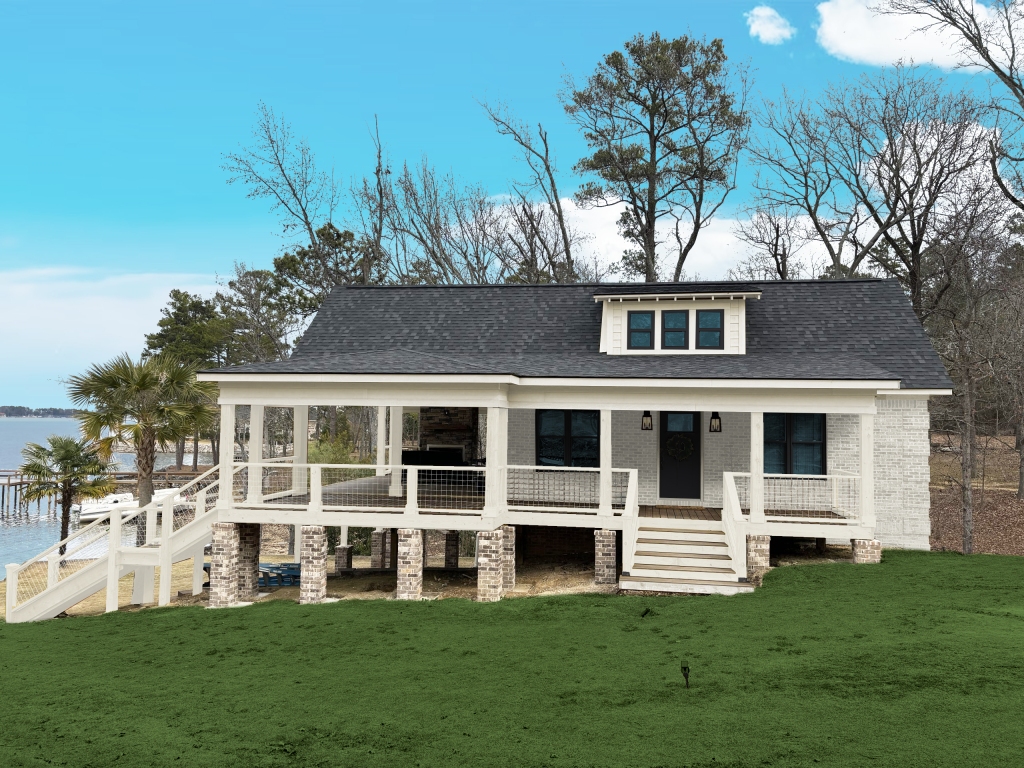
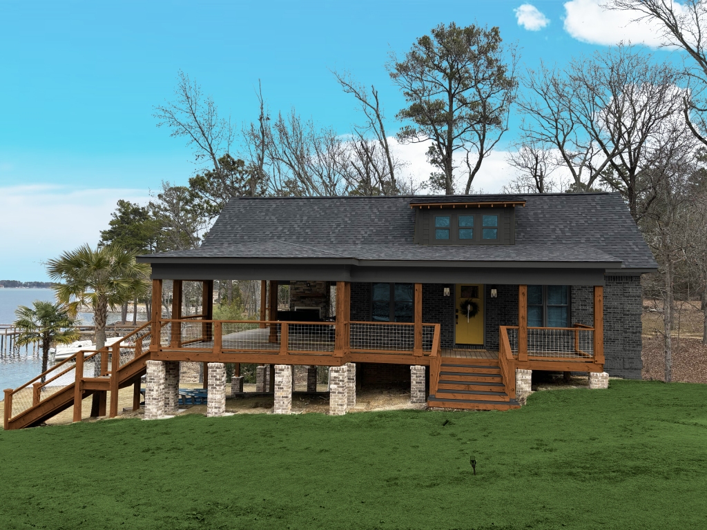
Deciding on exterior paint colors can be terrifying — it’s a big purchase, with both paint and labor being expensive — so mistakes can be costly. Frozen with fear, many homeowners decide not to decide at all.
To help with the decision process, many paint brands have an option on their sites to see their colors on an example home — and in some cases, on several styles of homes — but not many have the capability to show YOUR home in their colors. The ones that do haven’t refined the technology enough to accurately reflect colors and placement.
I began offering exterior consultations to bridge this gap and go beyond to show additional exterior upgrades, such as door styles, lighting, columns, windows, wood tones, siding types, etc.
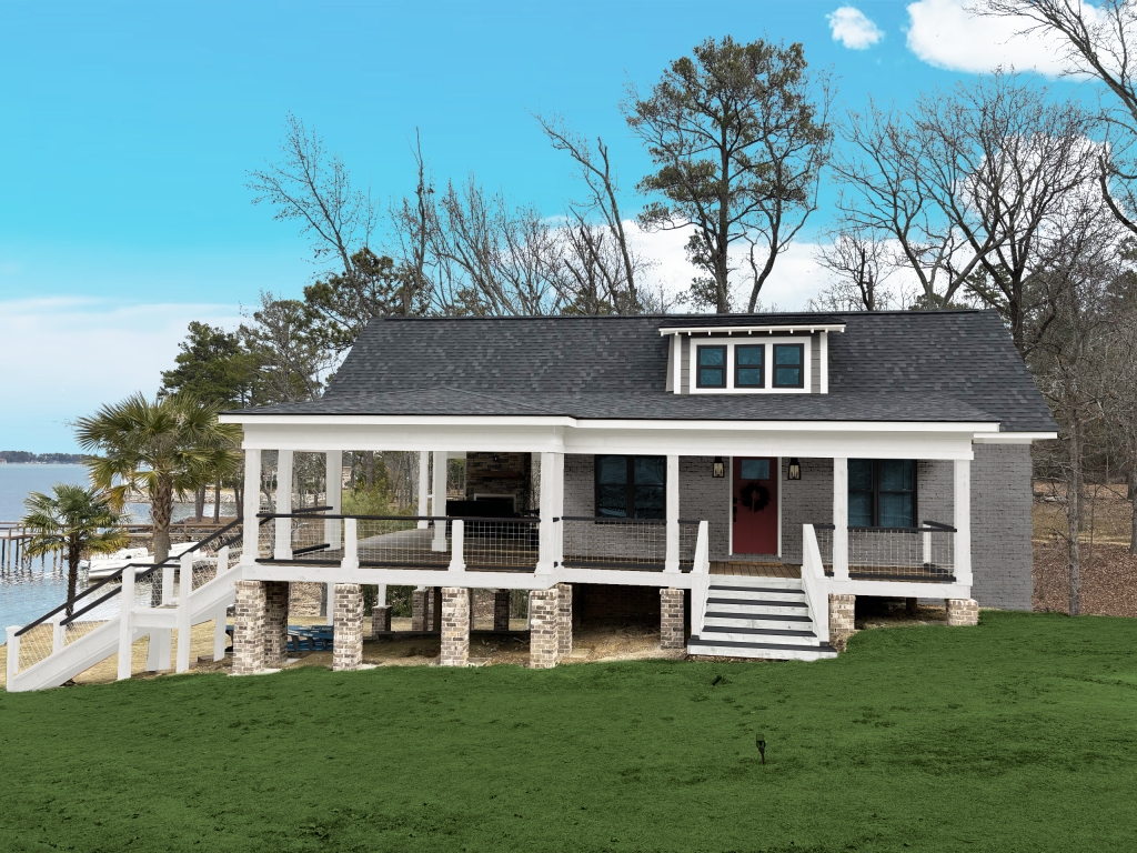
The process is simple — homeowners fill out a quick questionnaire where they can upload pictures of their home and inspiration pictures, then I put together mockups showing requested colors, or recommended colors (or a combination of both) and any other aesthetic exterior changes they’d like to see.
This is especially helpful for homeowners who are having difficulty visualizing colors together, or visualizing their anticipated changes together (i.e. different siding, stone veneers, etc), or are wavering between a few different options.
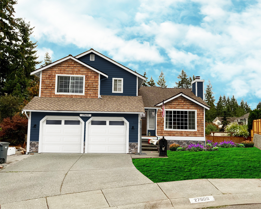
Original House
Option D
Option C
Option B
Option A
Someone wise said, “knowledge is power” – so now, armed with visualizations (and variations on the visualizations – the service also includes a handful of revisions), homeowners have the power to make decisions and, secure in the knowledge that they are avoiding costly mistakes, head to the paint store with confidence.
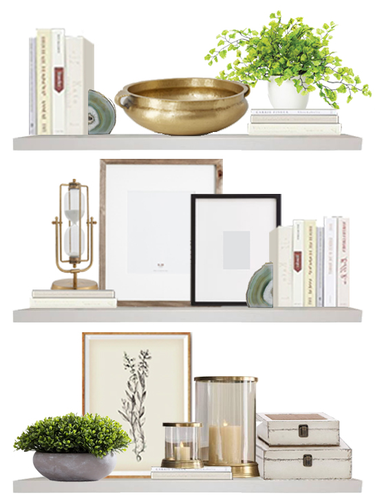
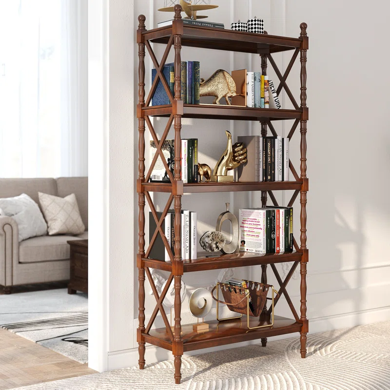
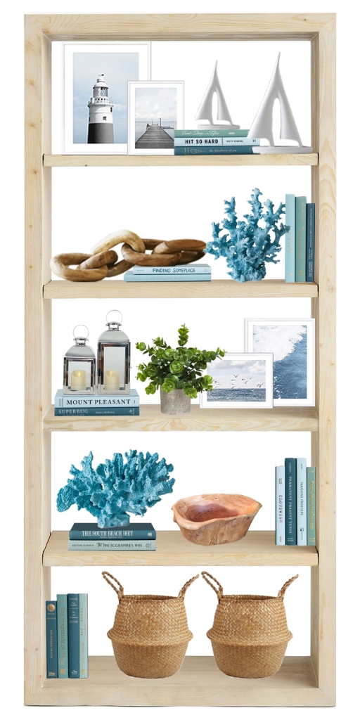
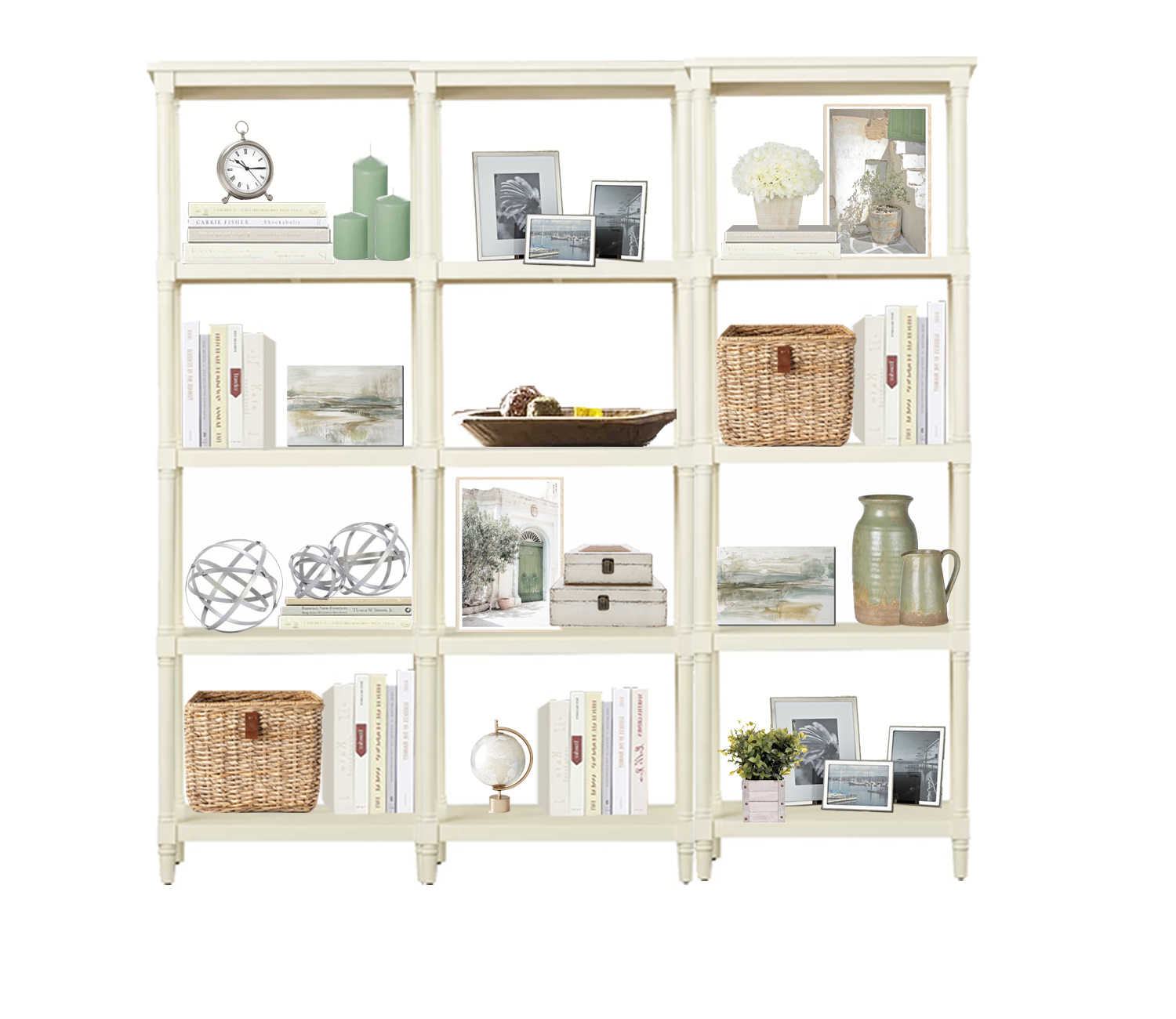
Most of my clients fall somewhere in-between, wanting a look that feels “complete” without feeling too busy or cluttered. When asked about how to accomplish this, I provide the following tips:
Use books and store them both vertically and horizontally; where possible, set smaller items on top of the horizontal books. For a more uniform feel, use books that have the same or similar color covers, or use a mix of books for a more eclectic feel.
Image source: Black Cat Interiors, Prepackaged Coastal Bookshelf Styling
If you don’t have your own books that you can use, thrift stores are a great place for inexpensive books. There are also online vendors such as booksbythefoot.com who sell books by color.
If you do have your own books but they are different colors and you’d prefer a more uniform look, you can always recover them using craft paper or even wrapping paper.
Sprinkle your accent color(s) throughout the shelves using various decorative items (vases, candles, small art pieces, etc).
Group similar items together (i.e. art/picture frames, sculptures, lanterns, etc.).
Overlap some of the items for a layered, designed look.
Using these tips, you’ll be on your way to a bookshelf that looks both stylish and intentional. But if you need more guidance, feel free to reach out – I’m happy to help!
One of the questions I receive most often from clients is, “Do these colors work together?“ The answer is both simple and complex. Simple, because almost any colors can work together, IF (the complex part) done correctly.
So how do you put colors together correctly? There are lots and lots of ways, but here are a few of my simple tips:
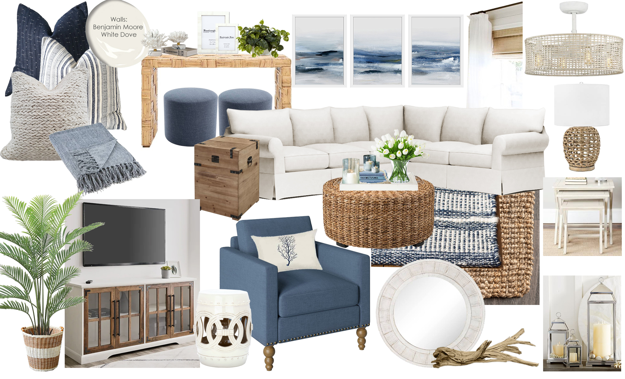
Create a neutral backdrop (beiges, ivories, whites, blacks, browns, grays, metals, wood tones) with your main pieces (sofa, rug, chairs, walls), then add one accent color of your choice via accessories (pillows, art, blankets, decor, etc.). Since your backdrop is neutral (i.e. not considered “colors”), any accent color will work great. In the living room moodboard below, the majority of the items are neutral, and I used navy as the pop of color.
Coastal Living Room Moodboard by Black Cat Interiors
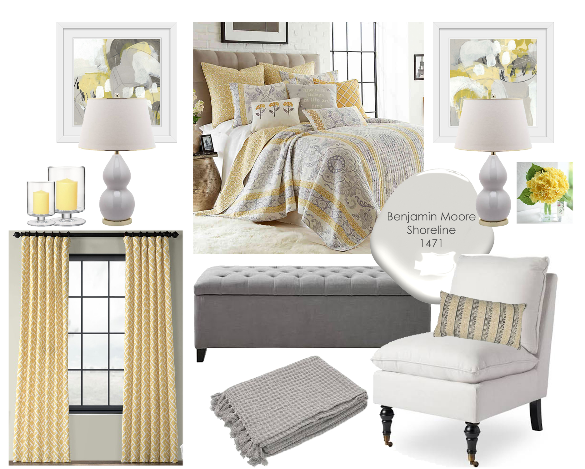
In the bedroom moodboard below, I created a neutral backdrop with the main items, and added a pop of sunny yellow.
Transitional Bedroom Moodboard by Black Cat Interiors
Another fail safe method is to pair analogous colors–that is, colors that are next to each other on the color wheel such as blue and green. Colors that are adjacent to each other on the color wheel will almost always create a harmonious palette.
Coastal Living Room Moodboard by Black Cat InteriorsBack Patio Deck Interior Design 3D Rendering by Black Cat Interiors
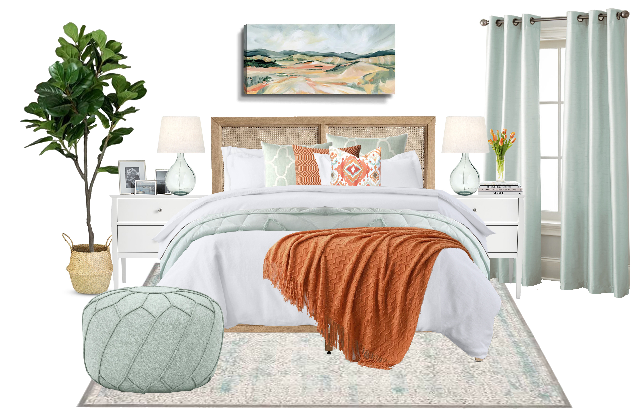
If you’re more bold and want to pair colors that aren’t as commonly found together but aren’t sure how to do it, start with one main item that already has the colors–such as a rug, or wall art–then pull those colors into the space via accessories. In the moodboard below, the art above the bed establishes the seafoam green and orange color palette, then I repeated those colors throughout the space.
Seafoam Green and Orange Bedroom Moodboard by Black Cat Interiors
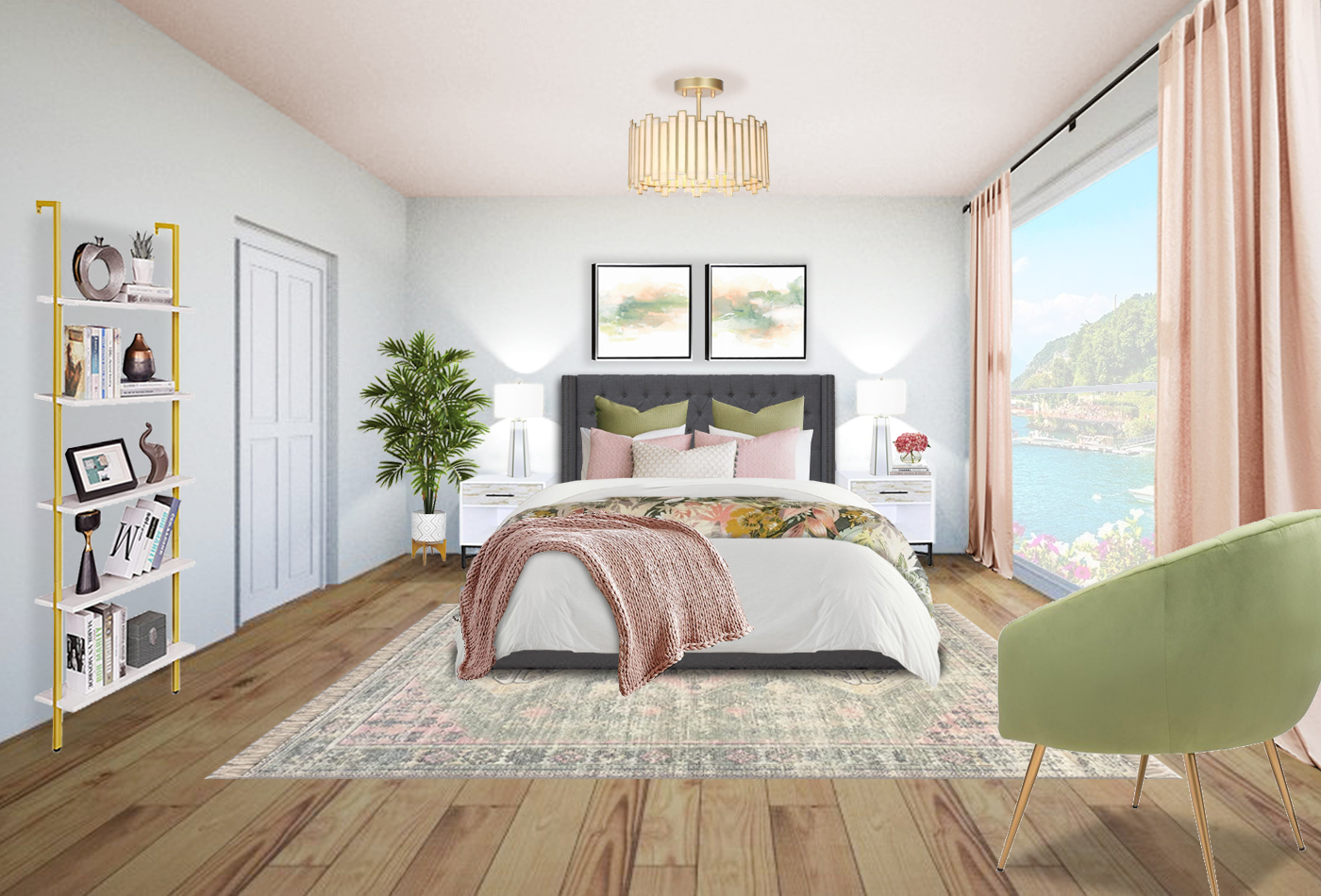
Rely on Mother Nature. In the moodboard below, I paired pink with green, a combo we’re used to seeing in nature via flowers, fruit, birds, etc.
Blush and Green Bedroom 3D Rendering by Black Cat Interiors
So, the short answer is, “Yes. The colors do work together.” Or, I should say, they can work together, IF paired correctly. Still not sure? Contact me – I’m happy to help!
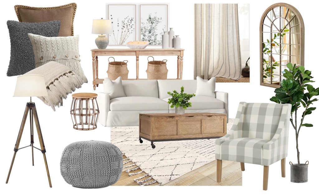
Farmhouse style became extremely popular years ago due to a certain show where the hosts “fixed up” old homes (I won’t name names 😀), and the style still going strong today! If you’re in love with this style like so many others, here are some tips to help achieve the look:
Use natural wood textures to add warmth and character; the more imperfect and/or reclaimed the wood finish, the more rustic your farmhouse space will be.
Choose a neutral color palette. Earthy neutrals like browns and ivories work well with wood textures, and while farmhouse designs don’t have to be neutral, they are generally associated with colors and textures that you would find in nature (or on a farm).
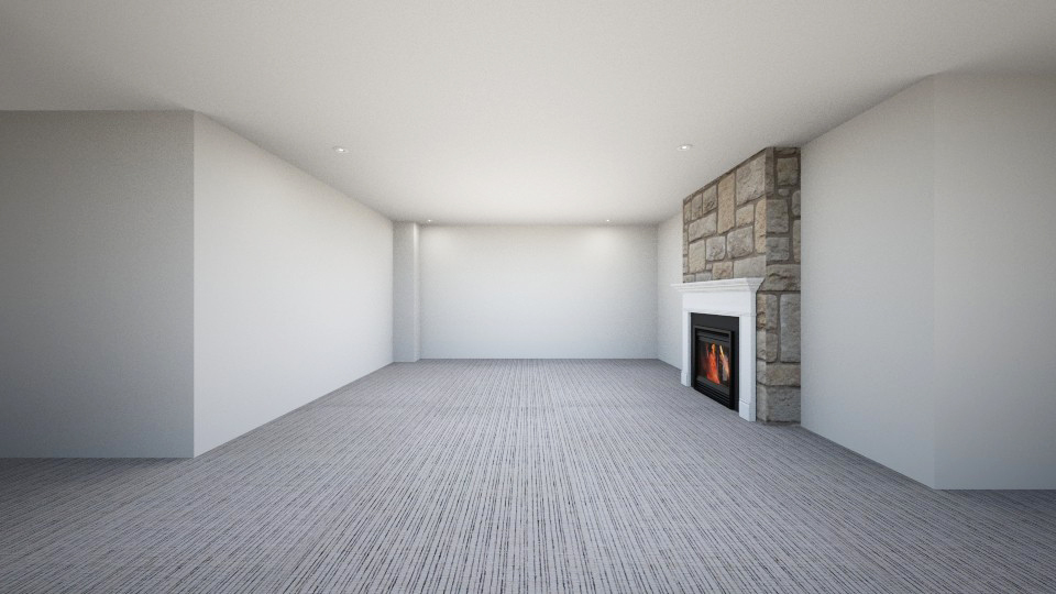
Furnishing basements can understandably be intimidating, as they are often large spaces with no clear purpose, and in some cases, have awkward layouts that make furniture placement difficult.
Empty basement rendering drawn in RoomStyler
When working with clients who are struggling with their basements, I start by having them identify the different ways the basement will be used (i.e. “functions”). For example:
Lounge/watch TV
Games/crafts
Homework
Adulting
From there we can create zones that will help identify what furniture is needed, and the best placement for it.
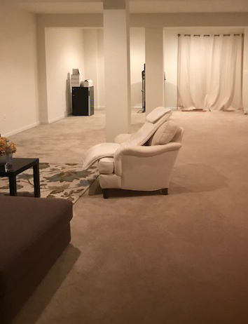
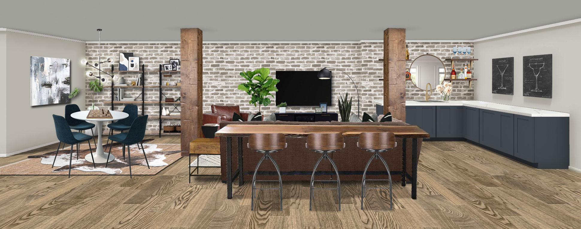
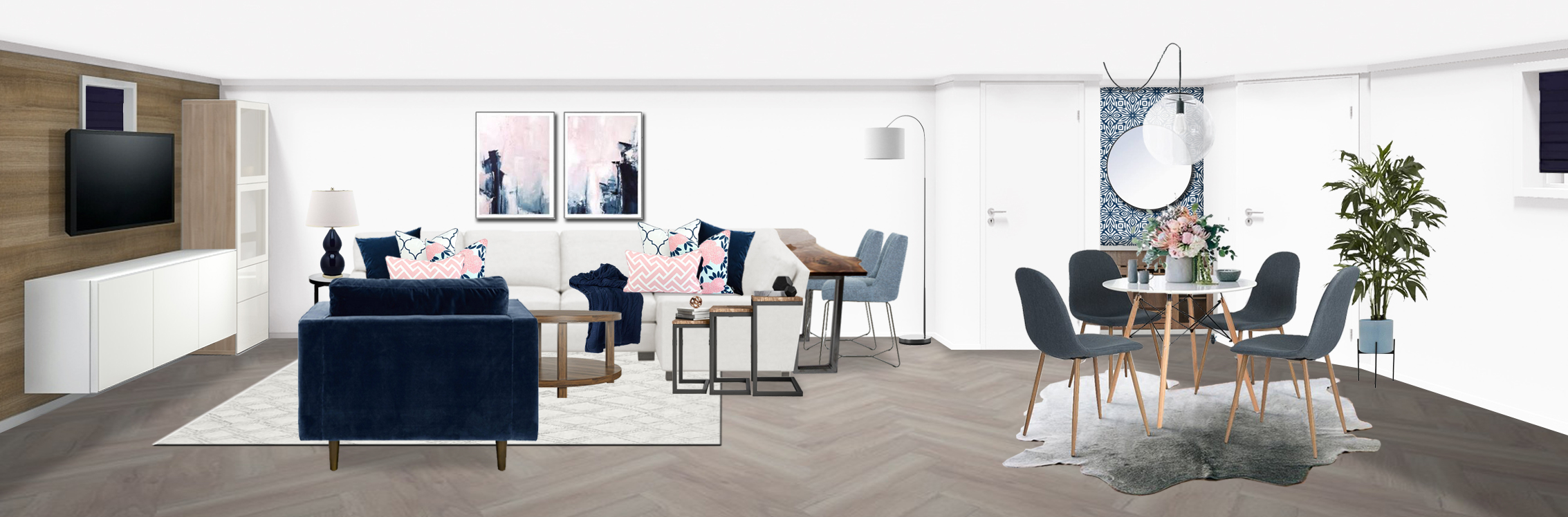
In the project below, the client had a long, relatively narrow space with posts placed awkwardly in the middle that made furniture layout a challenge.
To address function #1, I created a TV lounge zone between the posts with lots of seating options (sectional, chair, barstools behind sectional). To address functions #2 and #3, I included a small table and shelving on the left to create a homework/games/crafting zone. To address function #4 (arguably the most important), I included a wet bar on the right. I also wrapped the posts in wood to make them a feature instead of a hindrance.
Industrial basement online interior design 3D rendering by Black Cat Interiors
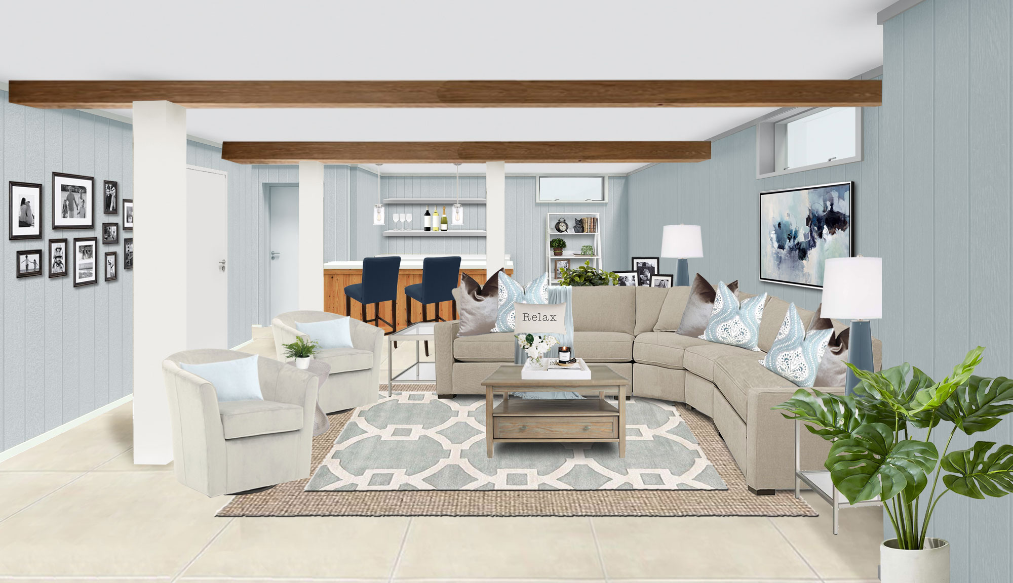
The client for the project below identified similar functions:
Lounge/watch TV
Homework/crafts/games
Adulting
Glam basement online interior design 3D rendering by Black Cat Interiors
Similarly, I created a TV lounge zone, added a table and chairs for a homework, crafts and games zone, and created a bar zone in what was previously a small, unused awkward recessed niche.
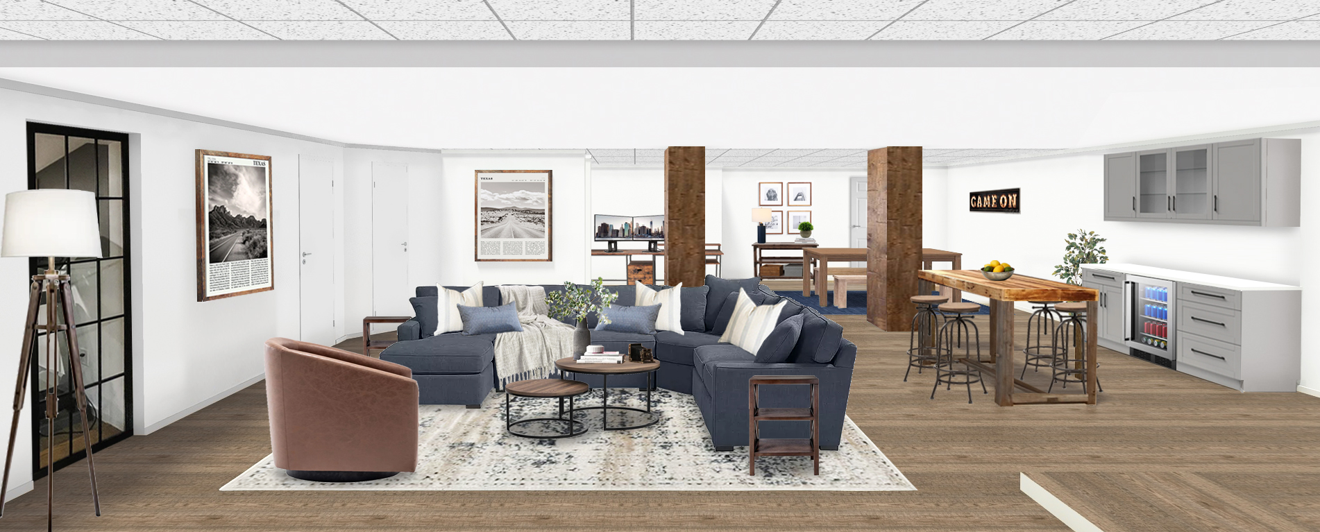
So if you’re stumped on how to furnish your basement, start with creating zones and work your way out from there. Or, try online interior design 😀.
Transitional basement online interior design 3D rendering by Black Cat InteriorsFarmhouse basement online interior design 3D rendering by Black Cat Interiors
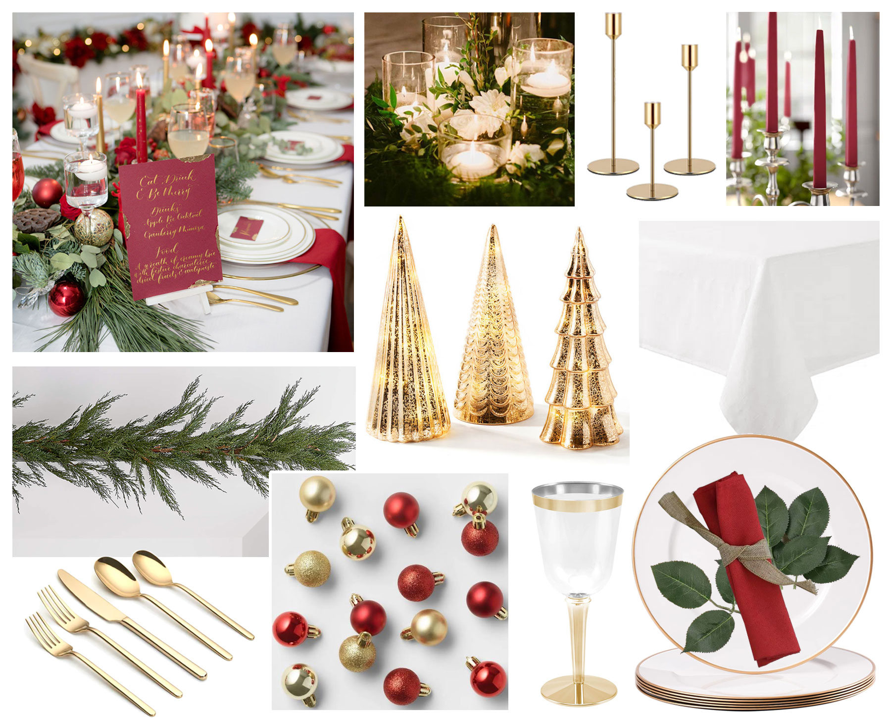
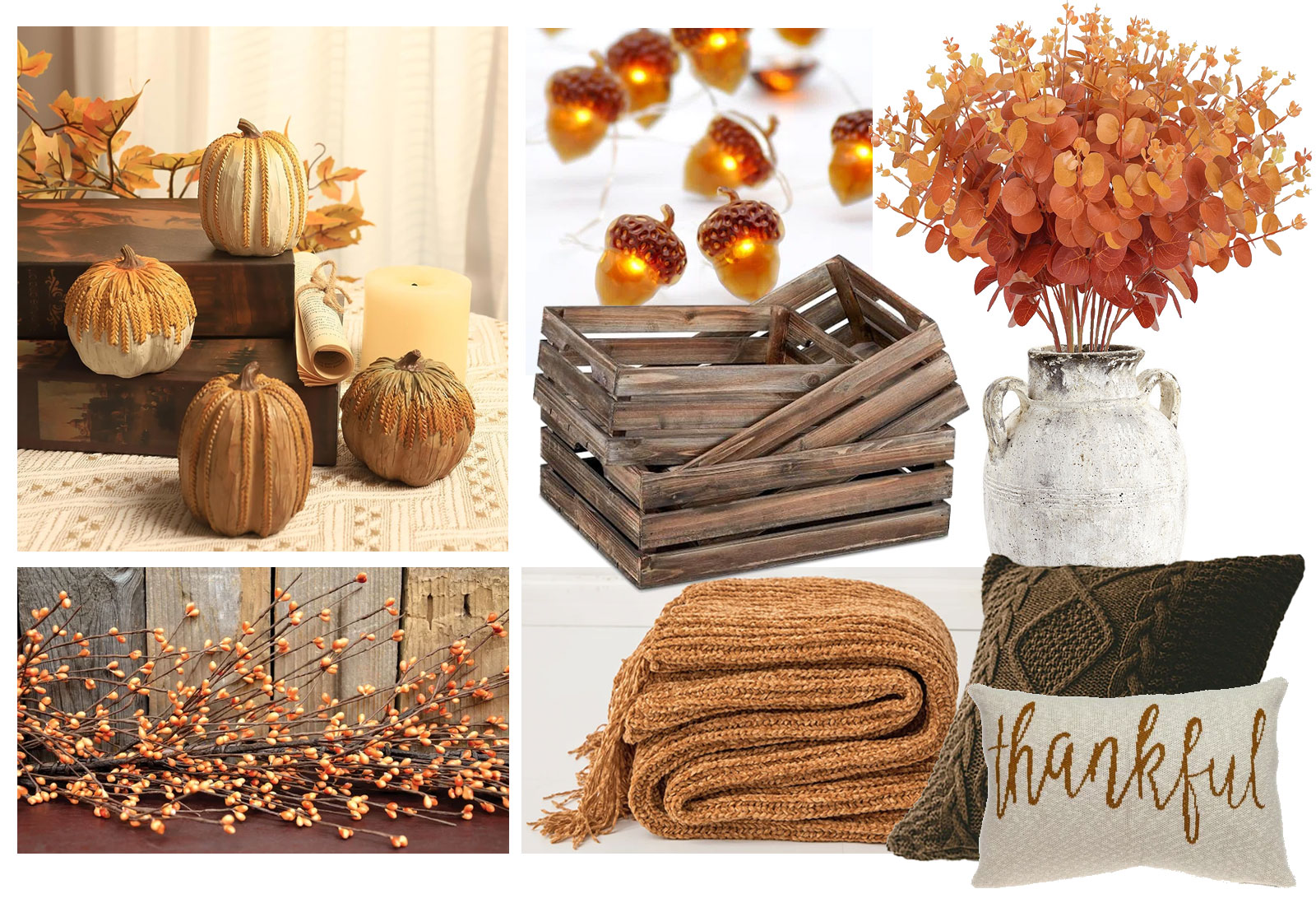
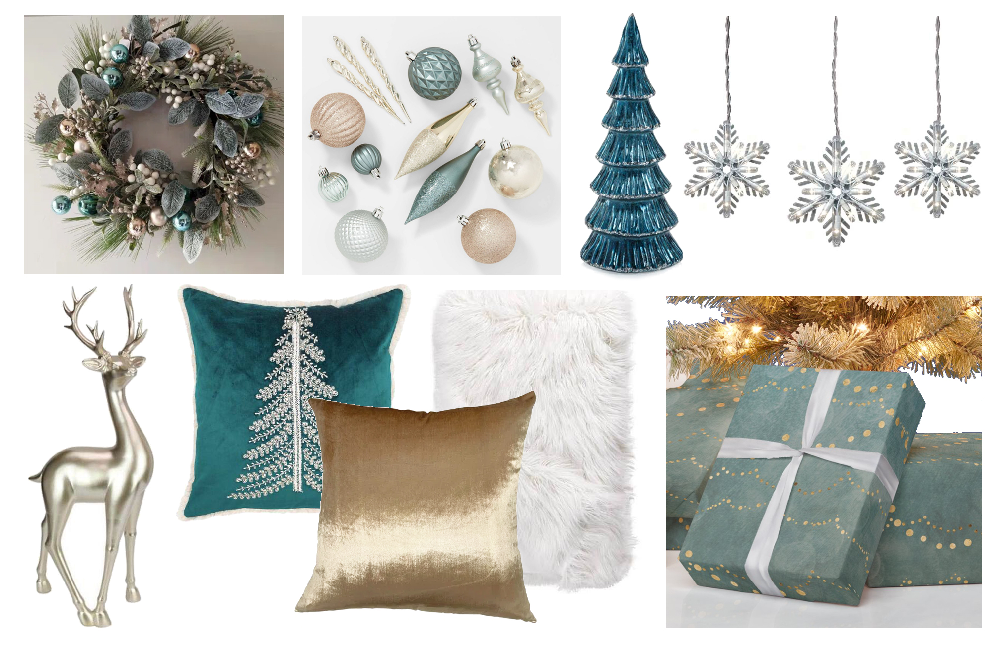
From a design perspective, one of the best parts of the holiday season is getting to do festive designs! While you may not associate online interior design with decorating for the holidays, I’m seeing an uptick in requests from previous years for holiday stylings. They’re so much fun to do, and I love the broad range of styles. Below are a few examples ranging from Modern Organic to Traditional Glam. What’s your interior design style for the holidays?